How Fonts Affect The Aesthetics Of A Small Business Website

The right or wrong small business website fonts can affect not only the aesthetics, but also the entire website design.
Upon viewing your small business website design, and the person ask ‘what font is that?’, they’re doing so for one of two reasons. One, either they really like the font and want to use it on their own website. Or two, it’s such a bad non complementary font and they don’t like it.
The best small business website fonts integrates seamlessly into the design and doesn’t draw unnecessary attention. In short, fonts are meant to enhance, and not obscure the brand’s look and feel or the customer experience.

When Done Right, Small Business Website Fonts Should Be complementary
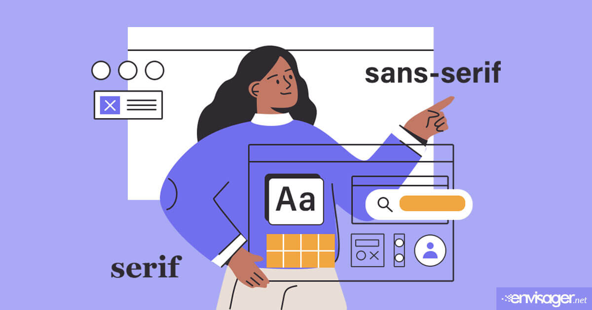
Whether serif or san serif, fonts don’t have to be dull or boring. Utilizing specific sizes, weights, and transforms, you can use fonts in different ways to create a unique look. For example, the West Coast Window Washing’s concise headlines are enhanced by 800 weight all caps style of the font Poppins.

Also, deliberate and logical typographic hierarchies should be implemented across all subpages. In our A Product Of His Grace (APOHG) example, the use of lighter weight and size in the headline font helps split up longer phrases or sentences. This deliberate separation acts as a quick guide to assist readers in digesting the information easier.
Even when a unique font works for headlines, you can still use a different font and size for smaller sections of pargraph. The small business website font used for APOHG’s body copy is Montserrat. Not only is this a crisp font, but it’s also easy to read on web pages.

How Fonts Affect The Aesthetics Of A Small Business Website
For every standard, there are exceptions to the rule. As such, there are cases in which a unique font can stand out and be noticed on a small business website design. This is particularly true if it was intentionally selected for the purpose of acting as a design differentiator.
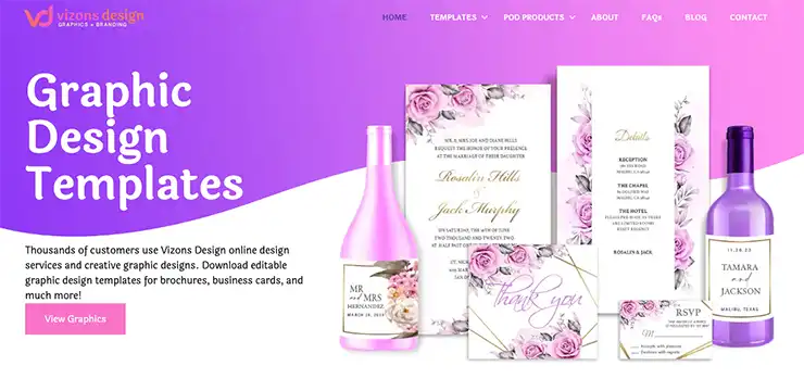
The above small business website shows how more distinctive typefaces can be used successfully on a small business website. Vizons Design offers graphic design templates that are designed by their graphic artists. For this reason, Laila font was chosen for the headline as it’s an informal sans serif design with brush terminals. Moreover, its contemporary, 21st century appearance lends to fun and friendliness. And the same font was used for body copy in a lighter weight to create balance.
Best Practices For Font Selections
The best practice is to follow the fonts specified in your brand style guide. If you don’t have one, select fonts that balance functionality with style to ensure your brand looks appropriate for your industry. But here are some web design tips to keep in mind when selecting your fonts.
- Don’t overly use ornate fonts as they can become overwhelming for longer headlines.
- Narrow your selection down to two font families maximum for your website.
- Avoid fonts from free sites as they may not have the legal rights to them.
- Select fonts with variations so that you have options for different thickness.
- Choose fonts based on ease of reading, versatility, etc.
- If cost is a factor, Google fonts are reliable and free to download.
Ultimately, fonts should work for you and not against your small business website UX or overall brand strategy. Another thing to remember is that comfortable reading is important for small business website fonts. So, don’t allow an unsuitable font hinder your brand communication.
Ready to chat about your small business website design project? Contact us today to discuss your website design goals.
You may also enjoy reading: Pros and Cons of AI

Dr. Amelia Davis
WEB DEVELOPMENT DIRECTOR
Dr. Amelia Royster-Davis is a Doctor of Education and an Instructional Designer. As the Director of Web Development at Envisager Studio, her primary focus is to lead the web development team in building modern, responsive websites. In her spare time, she writes about web development, UI and UX.


