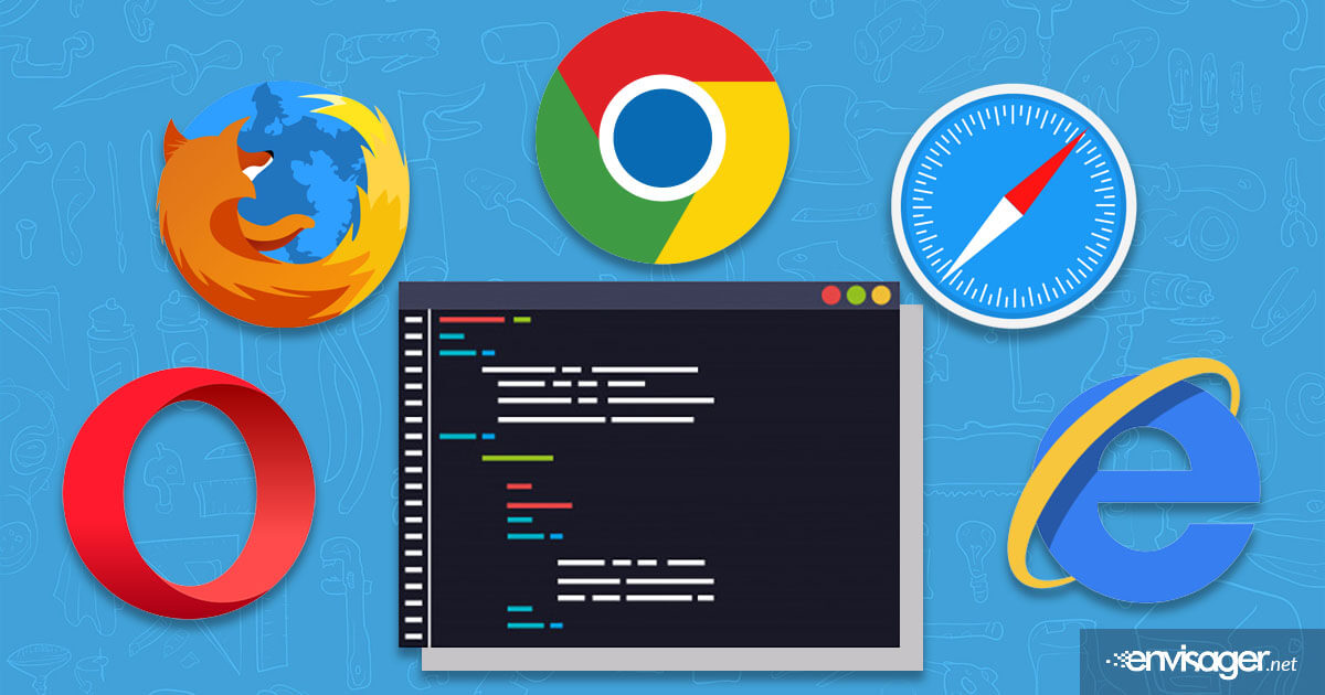
Cross Browser Compatibility Web Design

To further explain cross browser compatibility, imagine this scenario. Your beautiful new website design with all the latest technologies is finally finished. It looks great on your smartphone and tablet that you use daily. You are so excited and now ready to start advertising it to the world. Then a friend who uses everything Apple sends you an email containing a screenshot of your website, but with hideous inconsistencies.
To your intense dismay, you call your web developer in hysteria and you start hearing words like “cross browser compatibility”. You both speak the same language, but you have no clue what your web developer is referring to. So you quickly turn to your favorite browser; Internet Explorer (unfortunate for you) and start typing – “what is cross browser compatibility?” – and this is your search result:
[message type=”custom” width=”100%” start_color=”#1b9af6″ end_color=”#1b9af6″ border=”#1b9af6″ color=”#ffffff”]Cross-browser refers to the ability of a website, web application, HTML construct or client-side script to function in environments that provide its required features and to bow out or degrade gracefully when features are absent or lacking.[/message]
What that means in simply terms is that your website should have the capabilities and flexibilities to function properly on different web browsers.
Cross Browser Compatibility Explained
There are variety of browsers we use today. The five most popular browsers used in the United States are Google Chrome, Safari, Mozilla Firefox, Opera and Internet Explorer. These different browsers are developed by different companies. These browsers render the text written using HTML format, and then display the content in a webpage. Every browser’s text mode translation characteristics are different, which is the basic cause of the main differences between browsers. While there are stand rules for scripting HTML code, the translation or rendering is the source of the differences.
In addition to the browser differences, a web developer must also take into account the type of device the online surfer is using such as a PC and if the operating system is Mac, Windows or Linux. Each platform will render webpages slightly differently. Web developers should make sure that the website is compatible with each browser on all the varieties of operation systems for ideal responsive web design results.
Additionally, during website development, the differences in resolutions and screen sizes of the various computers must also be considered as these are also factors that will contribute to how a webpage is rendered.
Wrapping It Up
A website that has been tested over multiple browsers stands a better chance of uncovering discrepancies before the website goes live. Each browser interprets your website code in a slightly different manner, which means that it may appear differently to visitors using different browsers. Think of the end user first through the website design and development process. We would love to talk to you about your upcoming web design project or give you recommendations about your existing website. Contact us today at (858) 874-6528 or request a free website evaluation.

Hazel Burgess
FOUNDER/SEO DIRECTOR
Hazel is the Founder & SEO Director at Envisager Studio, a premier website design agency specializing in WordPress website design, development and internet marketing. In her spare time, she writes about search engine optimization, website design, and internet marketing.


