Best Restaurant Website Design Examples

Now more than ever, it’s important to have your restaurant online. Get inspiration from these restaurant website design examples – all designed by Envisager Studio.
With online prepared meals and ordering apps like Doordash, and others, it’s easy to see how ordering food has shifted. Thus, it’s critical that your restaurant business has an online presence and explore ways to market online.
The best restaurant websites have intuitive web designs, making it easy for users to find what they need. In this post, we’ll cover a few of the best restaurant website design examples that’s doing it right.
Restaurant Website Design Examples
Check out these restaurant websites, all designed by Envisager Studio, to help inspire your own restaurant website design.
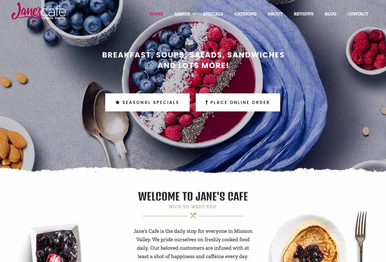
1. Jane’s Cafe Mission Valley
Jane’s Cafe, a San Diego American food restaurant, uses stunning visuals on their website. You can almost hear the low chatter of friends sharing coffee and dessert. Or imagine you’re sinking your teeth into their epic 8oz Angus Beef Steak Burger.
Ultimately, photos for any website should be high quality. But this is especially true for restaurant websites. Jane’s Cafe uses images to show us their delicious catering menu and their mouthwatering sandwiches.
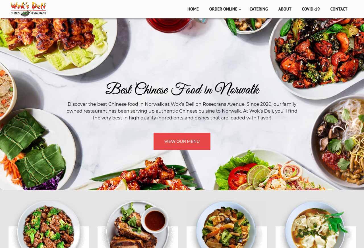
2. Wok’s Deli Chinese Restaurant
An appetizing array of meat and vegetable dishes greets us on the homepage of the Wok’s Deli restaurant website. A carousel invites us to explore their Buddha’s Feast, Wonton Soup, and other signature dishes.
This site earned the best restaurant website design examples because it’s not stingy with it’s plethora of food photography. Additionally, the title typography completely complements the photos and graphics. In addition to that, it uses plenty of negative space and unique section layouts to make the content stand out.
This design is all about consistency. From the typography used to the photos’ lightening and colors, everything works together. Not only does this deliver a smooth user experience, but it also encourages people to visit the restaurant.
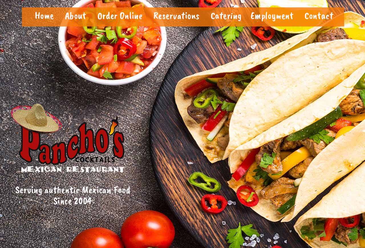
3. Pancho’s El Cajon
Pancho’s is an authentic Mexican restaurant in San Diego, California. This design has a very at-home feel that provides a welcoming atmosphere for family dining. With their monthly specials prominently displayed on their homepage, you always have an idea for what to order.
The navigation uses the bold ‘Boogaloo’ unique font that adds to the authentic food photos. In fact, this is one of the few restaurant website design examples that uses photos from their own menu. Although there’s noting wrong with using stock photography, if you have your own, why not use them? In the center of the homepage, you’ll find a gorgeous parallax background image with the chef’s favorites listed.
Pancho’s Mexican Restaurant has been around for nearly 20 years. Their authentic Mexican food coupled with restaurant-worthy catering, offers a genuine ‘let’s share a meal’ kind of feel. The navigation menu gives visitors easy access to things like their menu, reservations, and more. Pancho’s restaurant website design makes the decision to hire them or dine-in a no-brainer.
Get Started on Your Own Restaurant Website Design
Envisager Studio has some great design ideas for restaurant websites. For help, there’s always someone here to assist you, so get started today. And you’ll be excited to see what we can build for you! Already have a restaurant website design by Envisager Studio? We’d love to hear about it in the comments.

Dr. Amelia Davis
WEB DEVELOPMENT DIRECTOR
Dr. Amelia Royster-Davis is a Doctor of Education and an Instructional Designer. As the Director of Web Development at Envisager Studio, her primary focus is to lead the web development team in building modern, responsive websites. In her spare time, she writes about web development, UI and UX.
